
The ultimate goal of any giving page is to encourage visitors to make a donation. After filling out 10+ donate forms during GivingTuesday, I took note of the most engaging elements of a well-designed giving page and jotted down my best practices.
The key to success is a good user experience, and while your supporter is there keep them involved. Whether you are creating a giving page for the first time or need to refresh your organization’s page with new content, here are 5 things to consider when designing a giving page.
In a 2020 report, Nonprofit Tech For Good found that branded pages raise 6 times more funding than generic pages, so take advantage of your branding and make your giving page an extension of your website. Create trust by using your logo and brand colors and imagery—this reassures visitors that they are still on your site while making their donation.
Make sure to include compelling images, create an engaging video message, and add testimonials from current donors. Be sure to show how donation dollars were put to use over the past year (infographics are great for this!)
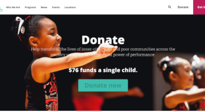
The All Stars Project Inc. giving page incorporates the spirit of their organization through both messaging and imagery. Their logo and color palette are clearly identifiable and the mission is clear. They even provide a snippet of what your donation dollars can provide.
Donors give 38% larger gifts to branded donation pages than to generic pages.
– Network for Good
Great content is step one. Collecting the donation is step two. Don’t lose your visitor with a complicated form and too many steps or choices.
Make donating easy and inspiring with these simple best practices.
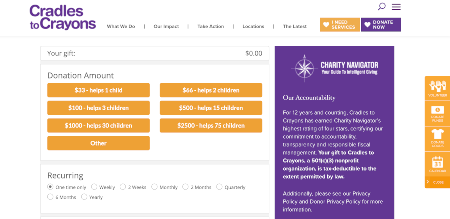
Cradles to Crayons is an example of an easy-to-navigate donation form that puts the tips above into practice, providing an effortless and feel-good experience.
Make donating fun and more equitable by sharing the variety of ways they can give. Start with a low amount ($10) so the cost doesn’t become a barrier. And encourage free ways to give such as social sharing, inviting family and friends to join, volunteering time, donating skills, organizing an event or creating a birthday fundraiser on social media.
Don’t forget to highlight additional ways donors can support your organization, such as corporate donations, employer donation matching, stock gifts, in-kind support, and estate planning options.
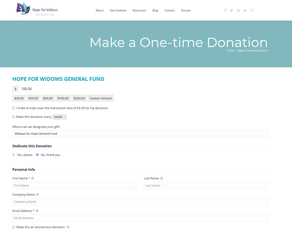
Hope for Widows shows an example of starting with a low amount, making the experience more inclusive.
Don’t lose a captive audience—keep them engaged to the end. Once your supporter hits the submit button, encourage them to explore your site and learn more about your organization.
Here are a few ways to boost engagement:
One-time donors who start on donation pages are more likely to return than donors who start on peer-to-peer campaigns or ticketed event campaigns.
– Classy
Be sure to write a meaningful thank you. Keep donors committed to your organization’s mission by sharing stories of your impact.
You don’t always have to ask donors for money but have a plan to ask for their support again. They will want to donate regularly if they feel a connection to your organization. And ongoing communication is a way to create that relationship.
There you have it. An effective giving page improves your fundraising performance. This means solid branding, a compelling message, good functionality, providing a variety of ways to give and keeping your audience engaged are critical to meeting fundraising goals. eting
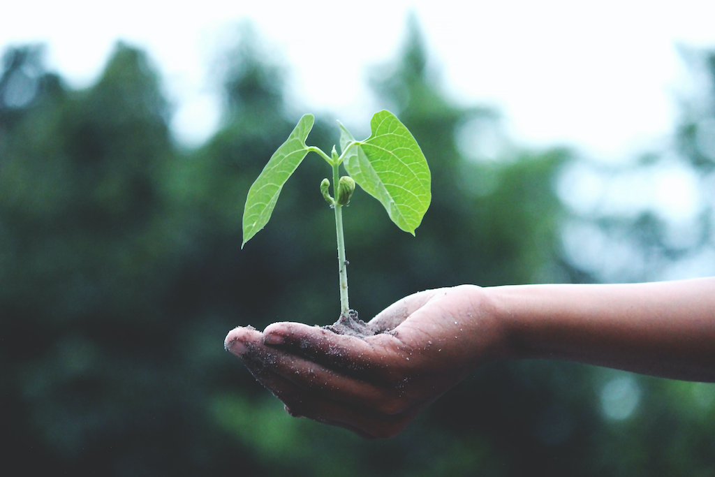
Photo by Akil Mazumder from Pexels