
An anniversary logo is more than just a design—it symbolizes the organization’s past achievements, present endeavors, and future aspirations. It helps to strengthen the organization’s identity, engage stakeholders, and leave a lasting impression.
This specially-designed logo marks a significant milestone such as the founding year and also serves as a powerful branding tool for celebration and acknowledgment.
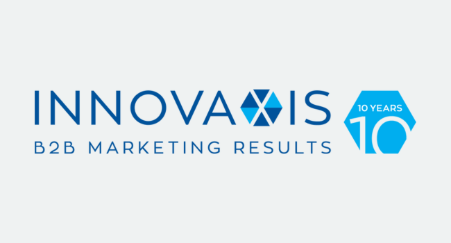
An anniversary logo visually represents an important milestone in the organization’s history. It celebrates the organization’s achievements, longevity, and unique journey.
A well-designed celebratory logo reinforces the organization’s brand identity. By integrating the anniversary theme with core brand elements (such as fonts and colors) the logo increases brand visibility and recognition, strengthening the connection between the organization’s past, present, and future.
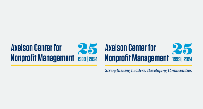
Anniversary logos become a focal point for anniversary-related activities, events, or marketing campaigns. They create excitement and engagement among team members, clients, partners, and the community, fostering a sense of belonging and pride. This engagement can lead to increased participation in anniversary celebrations.
Over time, an anniversary logo becomes part of the organization’s history. It becomes a visual representation of the organization’s evolution, contributing to its legacy. It not only commemorates the past but also inspires future growth and milestones.
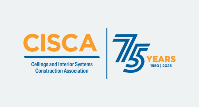
Designing a commemorative logo involves thoughtful consideration of the organization’s history, brand identity, and the intended use of the logo. Here are some best practices to ensure your anniversary logo is meaningful and effective:
Consider how the anniversary logo will be used: Will it be featured on large format signage, promotional items like t-shirts or mugs, or digital platforms? Understanding the various applications will ensure its versatility and impact.
Elements of the organization’s brand identity should be incorporated into the anniversary logo. Using the brand palette and fonts, while adding an accent color or special graphics, will highlight the special occasion while maintaining brand consistency.
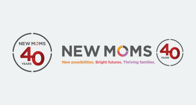
Experiment with different ways to display the number, anniversary year, or dates, along with other special design elements. This will set the logo apart from the main branding and convey the celebratory tone.
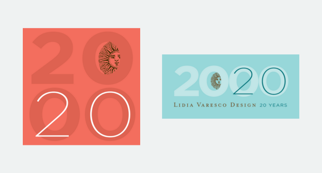
Read more about Lidia Varesco Design’s 20th anniversary in 2020.
Researching the organization’s history and including references or design elements that reflect its heritage and milestones can add depth and significance to the anniversary logo, making it more meaningful for stakeholders.
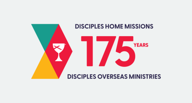
While an anniversary logo celebrates a specific milestone, it’s also important to create a design that stands the test of time and becomes part of the organization’s legacy.
The final logo should be created in various formats, including horizontal, stacked, and standalone icon versions. This ensures the logo is adaptable and can be used effectively across mediums and platforms.
Anniversary logos showcase your organization’s identity and brand and become a part of your history and legacy. By visually expressing this milestone, you have the potential to connect more deeply with your current audience—or even win over a new audience.
Want more branding and marketing tips and resources for your nonprofit, association, or other mission-focused organization? Join my monthly email list—plus get my free Nonprofit Branding Checklist.